23.4月8日 项目:学生成绩分析—个人雷达图绘制
绘制学生个人成绩雷达图
绘制雷达图,能直观的反映学生语文数学成绩,并就
- 某次考试的成绩和平均成绩进行对比
- 期中、期末成绩进行对比展现进步退步情况
目标图
1. 准备工作(已经完成的可以忽略):
还原mysql数据库,为了统一进度。本次数据库,进行统一还原操作
方式可以通过:
cj.sql
-
phpadmin
-
通过命令导入(本次使用)
通过以下命令将cj.sql传输进ubuntu
scp .\cj.sql xiandai@192.168.120.129:/home/xiandai
随后进入mysql 导入数据库
mysql> create database scores;
Query OK, 1 row affected (0.34 sec)

mysql> use scores;
Database changed

mysql> source /home/xiandai/cj.sql
记得通过 select * from student_scores;
查看导入效果。
2. python获取mysql数据
目标获取数据并转为dataframe形式
导入库(之前学习)
下载库:pip install -i https://pypi.tuna.tsinghua.edu.cn/simple xxxxxxx
# 数据分析三剑客
import numpy as np
import pandas as pd
from pandas import Series,DataFrame
import matplotlib.pyplot as plt
# 处理mysql
import pymysql
数据处理函数(之前学习)
def get_database_connection():
    connection = pymysql.connect(host='192.168.40.105',
                                 user='xd',
                                 password='123',
                                 db='scores',
                                 charset='utf8mb4',
                                 cursorclass=pymysql.cursors.DictCursor)
    return connection, connection.cursor()
获取数据函数并完成数据清洗(之前学习)
将缺考的“-4”进行处理,处理方式是删除。
def get_student_scores():
    """从数据库中获取学生成绩数据并将其转换为 pandas DataFrame。
    Args:
        None
    Returns:
        pandas.DataFrame: 包含学生成绩数据的 DataFrame。
    """
    conn, cursor = get_database_connection()
    try:
        cursor.execute("select * from student_scores;")
        # 一次性获取所有结果
        data = cursor.fetchall()
        # 将数据转换为 DataFrame
        df = pd.DataFrame(data)
        # 将"-4"替换为NaN
        df.replace(-4, np.nan, inplace=True)
        df.dropna(inplace=True)
        return df
    finally:
        conn.close()  # 关闭连接
3. 提取单个学生成绩
# 提取一位学生的中期成绩数据
df=get_student_scores()
# print(df)
labels = ['mid_term_chinese', 'mid_term_math', 'mid_term_english']
student_name='吴欢'
student_data =df[df['name']==student_name].iloc[0]
scores = student_data[labels].values.tolist()
print(scores)
4. 建立雷达图
在绘制雷达图时,我们通常使用极坐标系,而不是常规的直角坐标系。这是因为雷达图是一种用于显示多维数据的图表,它需要在不同方向上显示数据,并且不同方向的数据之间可能存在相关性。而极坐标系能够更自然地展示这种方向性和关联性。
极坐标系与直角坐标系不同,它使用角度和半径来表示数据点的位置,而不是直角坐标系中的x和y坐标。在雷达图中,每个数据点代表一个维度,而角度则表示每个维度的方向,半径则表示数据的大小。这样,我们可以通过在不同角度上放置数据点来展示多个维度的数据,从而形成雷达图的样式。
plt.rcParams['font.sans-serif']=['SimHei']
# 绘制雷达图
fig, ax = plt.subplots(figsize=(8, 8), subplot_kw=dict(polar=True))
# 对标题和Y轴范围进行处理
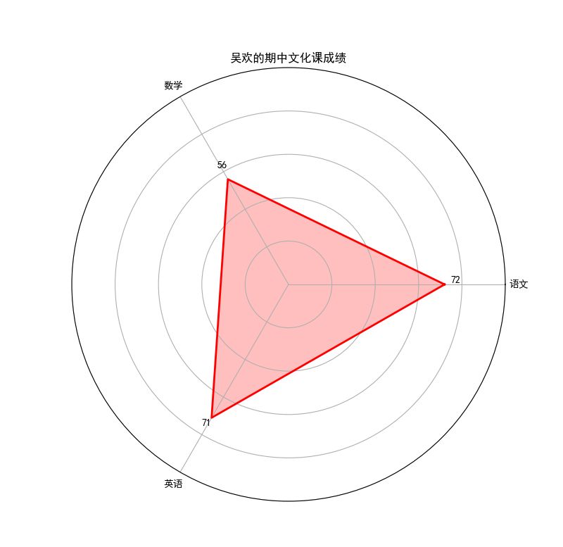
ax.set_title(f'{student_name}\'的期中文化课成绩')
ax.set_ylim(0,100)
labels = ['语文', '数学', '英语']
plt.show()
plt.subplots(figsize=(8, 8)): 这个函数用于创建一个图形(Figure)和一个或多个子图(Subplot)。figsize=(8, 8)参数指定了图形的大小,它是一个元组,包含了图形的宽度和高度,这里设置的是宽度和高度都为8英寸。
subplot_kw=dict(polar=True): 这个参数用于设置子图的属性。polar=True表示要创建一个极坐标系的子图,即雷达图所用到的坐标系类型。
5. 创建角度
在一个圆形的雷达图中,我们目前有三个数据分别是语文数学英语,故我们需要将360°进行三等分。
有个简单的办法,使用之前学习过的np生成等差数列。并转换成列表
angles = np.linspace(0, 2 * np.pi, 3, endpoint=False).tolist()
从0(0°)开始到2π(360°),分成3等分。
np.linspace(0, 2 * np.pi, len(labels), endpoint=False): 这部分代码使用NumPy库中的linspace函数来生成一个从0到2π(即360度)的等差数列,数列的长度为3,即雷达图中每个数据点对应的维度数。endpoint=False参数表示不包含结束点,即不包含2π。
.tolist(): 将生成的NumPy数组转换为Python列表。这样做是因为后续的绘图函数需要接受一个列表作为参数。
6. 画图
ax.fill(angles, scores, color='red', alpha=0.25) #画的是内部
ax.plot(angles, scores, color='red', linewidth=2) #画的是外部轮廓
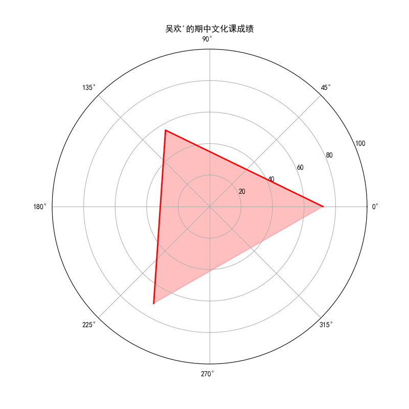
7. 问题修改
图中数据未“闭合”,我们调整数据使其更加美观
angles = np.linspace(0, 2 * np.pi, 3, endpoint=False).tolist()

scores += scores[:1]
angles += angles[:1]
scores += scores[:1]: 这行代码将列表scores的第一个元素(即scores[0])添加到列表末尾。这样做的效果是将首尾两个数据点连接起来,形成一个闭合的多边形。这是因为雷达图中,首尾两个数据点应该是连接在一起的,以便形成一个完整的图形。
例如,如果原始的scores列表为[72, 56, 71],那么经过这行代码处理后,scores列表将变为[72, 56, 71, 72],即在末尾添加了首个元素,使得数据点首尾连接。
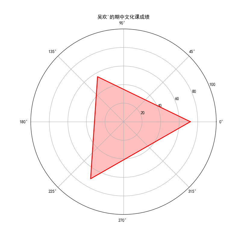
8. 美化,添加标签
标签
# 添加标签
ax.set_xticks(angles[:-1])
ax.set_xticklabels(labels)
ax.set_xticklabels(['语文','数学','英语']) # 清空Y轴刻度标签
在数据上进行标注
# 在Y轴上添加文本标签
for i in range(3):
    ax.text(angles[i], scores[i]+5, str(int(scores[i])), color='black', fontsize=10, ha='center', va='bottom')
阶段整理
至此我们完成了单个学生的成绩雷达图,我们需要对绘图部分封装成函数
import numpy as np
import pandas as pd
from pandas import Series,DataFrame
import matplotlib.pyplot as plt

import pymysql

def get_database_connection():
    connection = pymysql.connect(host='192.168.40.105',
                                 user='xd',
                                 password='123',
                                 db='scores',
                                 charset='utf8mb4',
                                 cursorclass=pymysql.cursors.DictCursor)
    return connection, connection.cursor()

def get_student_scores():
    conn, cursor = get_database_connection()
    try:
        cursor.execute("select * from student_scores;")
        data = cursor.fetchall()
        df = pd.DataFrame(data)
        df.replace(-4, np.nan, inplace=True)
        df.dropna(inplace=True)
        return df
    finally:
        conn.close()

df = get_student_scores()

# 提取一位学生的中期成绩数据
student_name = '吴欢'  # 选择要绘制雷达图的学生
student_data = df[df['name'] == student_name].iloc[0]
scores = student_data[['mid_term_chinese', 'mid_term_math', 'mid_term_english']].values.tolist()


# 绘制雷达图
plt.rcParams['font.sans-serif']=['SimHei']
fig, ax = plt.subplots(figsize=(8, 8), subplot_kw=dict(polar=True))
ax.set_title(f'{student_name}的期中文化课成绩')
ax.set_ylim(0,100)
labels = ['语文', '数学', '英语']

# 创建角度
angles = np.linspace(0, 2 * np.pi, 3, endpoint=False).tolist()
# angles = [angle + np.pi/2 for angle in angles]
scores += scores[:1]
angles += angles[:1]
ax.fill(angles, scores, color='red', alpha=0.25)
ax.plot(angles, scores, color='red', linewidth=2)

# 添加标签
ax.set_yticklabels([])  # 清空Y轴刻度标签
ax.set_xticks(angles[:-1])
ax.set_xticklabels(labels)
# 在Y轴上添加文本标签
for i in range(3):
    ax.text(angles[i], scores[i]+5, str(int(scores[i])), color='black', fontsize=10, ha='center', va='bottom')

# 显示图形
plt.show()
封装后
import numpy as np
import pandas as pd
from pandas import Series,DataFrame
import matplotlib.pyplot as plt

import pymysql

def get_database_connection():
    connection = pymysql.connect(host='192.168.40.105',
                                 user='xd',
                                 password='123',
                                 db='scores',
                                 charset='utf8mb4',
                                 cursorclass=pymysql.cursors.DictCursor)
    return connection, connection.cursor()

def get_student_scores():
    conn, cursor = get_database_connection()
    try:
        cursor.execute("select * from student_scores;")
        data = cursor.fetchall()
        df = pd.DataFrame(data)
        df.replace(-4, np.nan, inplace=True)
        df.dropna(inplace=True)
        return df
    finally:
        conn.close()

def draw_stu(df,student_name):
    student_data = df[df['name'] == student_name].iloc[0]
    scores = student_data[['mid_term_chinese', 'mid_term_math', 'mid_term_english']].values.tolist()


    # 绘制雷达图
    plt.rcParams['font.sans-serif']=['SimHei']
    fig, ax = plt.subplots(figsize=(8, 8), subplot_kw=dict(polar=True))
    ax.set_title(f'{student_name}的期中文化课成绩')
    ax.set_ylim(0,100)
    labels = ['语文', '数学', '英语']

    # 创建角度
    angles = np.linspace(0, 2 * np.pi, 3, endpoint=False).tolist()
    # angles = [angle + np.pi/2 for angle in angles]
    scores += scores[:1]
    angles += angles[:1]
    ax.fill(angles, scores, color='red', alpha=0.25)
    ax.plot(angles, scores, color='red', linewidth=2)

    # 添加标签
    ax.set_yticklabels([])  # 清空Y轴刻度标签
    ax.set_xticks(angles[:-1])
    ax.set_xticklabels(labels)
    # 在Y轴上添加文本标签
    for i in range(3):
        ax.text(angles[i], scores[i]+5, str(int(scores[i])), color='black', fontsize=10, ha='center', va='bottom')

    # 显示图形
    plt.show()

df = get_student_scores()
draw_stu(df,'吴欢')
9.修改主函数,使得能绘制班级所有学生的雷达图
将显示改为保存
    # 显示图形
    # plt.show()
    plt.savefig(student_name+'.png')
    plt.close('all')
步骤一:利用之前学习的questionary
需要安装,下载库:pip install -i https://pypi.tuna.tsinghua.edu.cn/simple xxxxxxx
from questionary import select
步骤二:创建选择
question = select("选择分析的班级:", choices=["23401", "23402", "23403"])
choice_class = question.ask()
print("您选择的班级是:", choice_class)
步骤五:根据选择,调整整个代码
主程序部分:
question = select("选择分析的班级:", choices=["23401", "23402", "23403"])
choice_class = question.ask()
print("您选择的班级是:", choice_class)

df=df[df['class']==choice_class]

stu_list=df['name'].tolist()
for student_name in stu_list:
    draw_stu(df,student_name)
函数修改:将显示改为保存
    # 显示图形
    # plt.show()
    plt.savefig(student_name+'.png')
    plt.close('all')
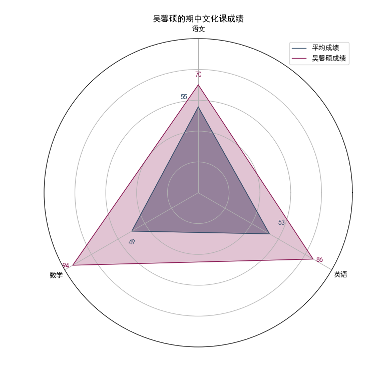
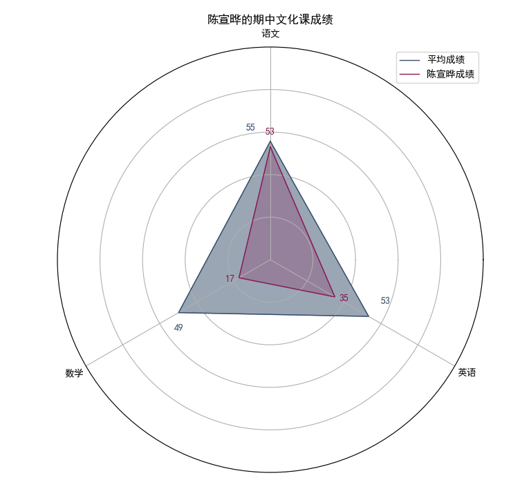
10. 修改draw_stu函数,使其再画上平均成绩
在draw_stu中
    # 计算各科目平均成绩
    average_scores=df[['mid_term_chinese', 'mid_term_math', 'mid_term_english']].mean().values.tolist()

    #。。。。。

    # 绘制平均成绩图
    average_scores += average_scores[:1]
    ax.fill(angles, average_scores, color='#364F6B', alpha=0.5)
    ax.plot(angles, average_scores, color='#364F6B', linewidth=1,label='平均成绩')

    #。。。。。


    # 在Y轴上添加平均成绩文本标签
    for i in range(3):
        ax.text(angles[i]+0.15, average_scores[i]+5, str(int(average_scores[i])), color='#364F6B', fontsize=10, ha='center', va='bottom')

    # 为了区分加上标签
    ax.legend(loc='best')
补充
为了美观,我调整了坐标轴方向
    # 创建角度
    angles = np.linspace(0, 2 * np.pi, 3, endpoint=False).tolist()

    # 为了美观,可以加上这条
    angles = [angle + np.pi/2 for angle in angles]
完整代码
import numpy as np
import pandas as pd
from pandas import Series,DataFrame
import matplotlib.pyplot as plt
from questionary import select
import pymysql

def get_database_connection():
    connection = pymysql.connect(host='192.168.40.105',
                                 user='xd',
                                 password='123',
                                 db='scores',
                                 charset='utf8mb4',
                                 cursorclass=pymysql.cursors.DictCursor)
    return connection, connection.cursor()

def get_student_scores():
    conn, cursor = get_database_connection()
    try:
        cursor.execute("select * from student_scores;")
        data = cursor.fetchall()
        df = pd.DataFrame(data)
        df.replace(-4, np.nan, inplace=True)
        df.dropna(inplace=True)
        return df
    finally:
        conn.close()

def draw_stu(df,student_name):
    student_data = df[df['name'] == student_name].iloc[0]
    scores = student_data[['mid_term_chinese', 'mid_term_math', 'mid_term_english']].values.tolist()
    average_scores=df[['mid_term_chinese', 'mid_term_math', 'mid_term_english']].mean().values.tolist()

    # 绘制雷达图
    plt.rcParams['font.sans-serif']=['SimHei']
    fig, ax = plt.subplots(figsize=(8, 8), subplot_kw=dict(polar=True))
    ax.set_title(f'{student_name}的期中文化课成绩')
    ax.set_ylim(0,100)
    labels = ['语文', '数学', '英语']

    # 创建角度
    angles = np.linspace(0, 2 * np.pi, 3, endpoint=False).tolist()

    # 为了美观,可以加上这条
    angles = [angle + np.pi/2 for angle in angles]


    scores += scores[:1]
    angles += angles[:1]
    average_scores += average_scores[:1]
    ax.fill(angles, average_scores, color='#364F6B', alpha=0.5)
    ax.plot(angles, average_scores, color='#364F6B', linewidth=1,label='平均成绩')

    ax.fill(angles, scores, color='#891652', alpha=0.25)
    ax.plot(angles, scores, color='#891652', linewidth=1,label=student_name+'成绩')

    # 添加标签
    ax.set_yticklabels([])  # 清空Y轴刻度标签
    ax.set_xticks(angles[:-1])
    ax.set_xticklabels(labels)
    # 在Y轴上添加文本标签
    for i in range(3):
        ax.text(angles[i], scores[i]+5, str(int(scores[i])), color='#891652', fontsize=10, ha='center', va='bottom')

    # 在Y轴上添加文本标签
    for i in range(3):
        ax.text(angles[i]+0.15, average_scores[i]+5, str(int(average_scores[i])), color='#364F6B', fontsize=10, ha='center', va='bottom')

    ax.legend(loc='best')

    # 显示图形
    # plt.show()
    plt.savefig(student_name+'.png')
    plt.close('all')
    return

df = get_student_scores()
question = select("选择分析的班级:", choices=["23401", "23402", "23403"])
choice_class = question.ask()
print("您选择的班级是:", choice_class)

df=df[df['class']==choice_class]

stu_list=df['name'].tolist()
for student_name in stu_list:
    draw_stu(df,student_name)